Blog / 2024 / My Artistic Nemesis
July 8, 2024
If you’re open to sharing about your artistic nemesis, I hope you’ll email me! I explain how I dye clothing in this video and why no one can ever paint like anyone else in my TEDx talk.
You can see the painting featured in this video at Art House Productions’ Affordable Art Show in Liberty State Park, Jersey City, New Jersey!
July 13th from 11 am to 5:30 pm
July 14th from 11 am to 5:30 pm
July 20th from 11 am to 5:30 pm
July 21st from 11 am to 5:30 pm
Art House Productions’ booth
South Entrance Lobby, across from the ferry
CRRNJ Terminal Building
1 Audrey Zapp Drive
Jersey City, NJ 07305
There’s free two-hour parking in Lot 9, across from the terminal.
If you want to help me befriend my nemesis, you can hire hire me to paint your home! Because that’s the thing: a decade or so ago, I made “home portrait” an option on my custom art price list, and, as you can see in the video, I’ve only received a couple of commissions since then. But I keep the “home portrait” option on my site, because, before I posted it, a number of people had asked me to paint their house, and, when I quoted my price to them, they tried to bargain me down. Most of them pointed to the fact that “home portrait” wasn’t listed on my custom art page as a the reason why they felt it was appropriate to question the price.
For the record, with custom art, I’m rarely open to negotiation—I think artists should always charge more for commissioned pieces. After 21 years as a full-time artist, I may still be working out how I like to paint long smooth lines, but I’m certain about how I price my art, even my paintings of buildings, because I know what art actually is.
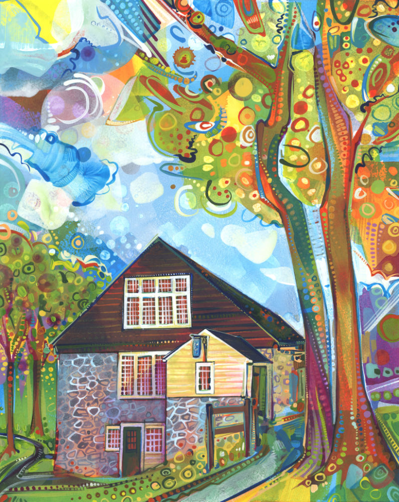
Phillips’ Mill
2024
acrylic and ink on paper
14 x 11 inches
VIDEO TRANSCRIPT
I don’t paint a lot of buildings—I mean, there was this brief moment about ten years ago where I did do a few home portraits. But, generally speaking, this is unusual.
It’s not that I don’t like to paint buildings; it’s more that I feel like there are lots of other artists who are doing that and so they have that covered. Sort of like how lots of people have wearing blue denim covered, so I feel like it’s my job to dye jeans before I wear them, or else it would be too much blue—too many paintings of buildings.
Though I don’t think I’ll ever find it necessary to wear blue denim, sometimes painting a building makes sense.
It’s a practice of getting outside of my usual practice, because it means sitting down with my nemesis. Every artist has one: a subject or technique that they just can’t get the hang of. And, for me, it’s straight lines.
Growing up, I remember asking my mom to draw lines for me and I remember her encouraging me to figure out how to do it myself. But the truth is that I am not now—nor have I ever been—someone with a hand that’s steady in that way. In fact, maybe that’s a better description of my nemesis: the steadiness of a sign painter’s hand. I mean, I do okay. I paint and draw with confident marks. But smooth lines—whether they’re straight or curved—remain difficult for me.
Which is why architecture isn’t something I paint too much. Well, that, and the thing where other artists have it covered. Except, of course, they also don’t. In the sense that no one else will ever paint a building like I can, because no one else is me and no one has precisely the same weirdly antagonistic relationship with smooth long lines.
In the case of this painting, I decided to remove distractions in order to more fully face off with my nemesis. I limited my palette to titanium white, burnt umber, primary cyan, permanent violet, cadmium orange, quinacridone gold, nickel azo yellow, and maybe some hansa yellow medium. That may seem like a lot of pigments, but forgoing a darker blue* and any green or purely red pigments is different from my usual practice.
This method of limiting my palette was something I used to do a lot of when I was first starting out as an artist. At that point, it was a way of getting to know the pigments and how they interacted with each other. But for this painting, I wanted to concentrate on the way the lines in the piece intersect. Keeping the palette more focused seemed like a good way to do that.
I’m happy with how this painting came out. I don’t feel like buildings are going to become my thing now, but this has inspired me to challenge myself to paint at least one building a year. It’s a slow-burn befriending of my nemesis and it leaves me wondering: what is your artistic nemesis? How have you made friends with it?
Did this post make you think of something you want to share with me? I’d love to hear from you!
To receive an email every time I publish a new article or video, sign up for my special mailing list.